Hulu redesign may drop the confusing screen called ‘Lineup,’ simplify navigation
Hulu is preparing to update its streaming app in order to make its simpler to navigate to and discover content you want to watch. Some of the changes coming in the weeks ahead are smaller, but worthwhile tweaks – like adding buttons or re-arranging where menus sit. But the more notable change is that Hulu is testing doing away with the app’s existing landing page – currently known as “Lineup” – and replacing it with a new experience.
There’s a possibility that the testing might reveal that viewers prefer “Lineup” over “Hulu Picks” so the company can’t definitively say that it will drop Lineup permanently.
That’s a change that could have a significant impact, as the Hulu landing page is the place everyone first lands when they launch the app. The page today sees the most engagement and is biggest driver of content discovery for the streaming service.
Hulu found that users have short attention spans when hitting this page, however – in 30 to 60 seconds’ time, they’ve lost interest. Plus, when users decide to play a piece of content from this landing page, they’re doing so after five actions or less. That means Hulu has only a small window to connect viewers to content they’ll like, before they click away to elsewhere in the app – or close it altogether because they can’t find something to watch.
What Hulu now wants to learn is what sort of content makes the most sense for this landing page. “Lineup,” after all, is a vague term. It sounds like it’s something highly personalized to the viewer – and it’s clearly not, as any Hulu user can tell you, the suggestions here are often hit-or-miss.
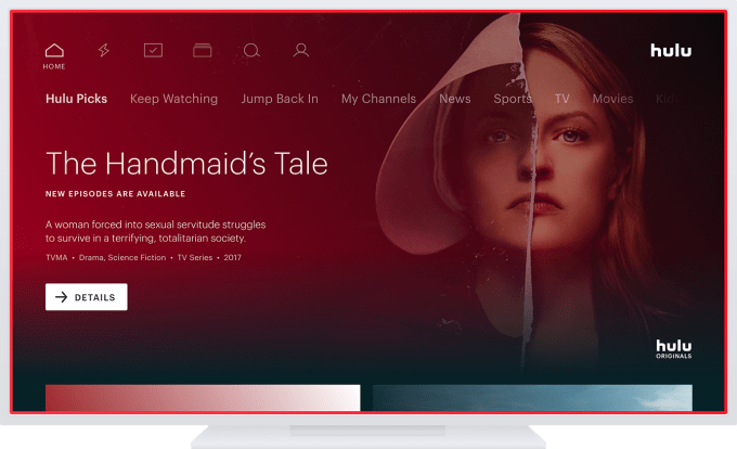
In its place, Hulu will trial two different variations: a “Hulu Picks” collection, which is curated by staff, and an “Unwatched in My Stuff” option that will show you things you have on your list, but haven’t yet watched.
The former, “Hulu Picks,” would allow the company to have more control over what sort of content suggestions you see first. While the latter option would showcase content you’ve explicitly indicated interest in viewing.
The company says it will test both options with a portion of Hulu’s user base in order to determine which one sees the best response. This will roll out in the weeks ahead.
Meanwhile, other changes to the Hulu app will be focused on helping you view more content while searching for something to watch, as well as helping you to more easily navigate, and start watching with less confusion and fewer steps.
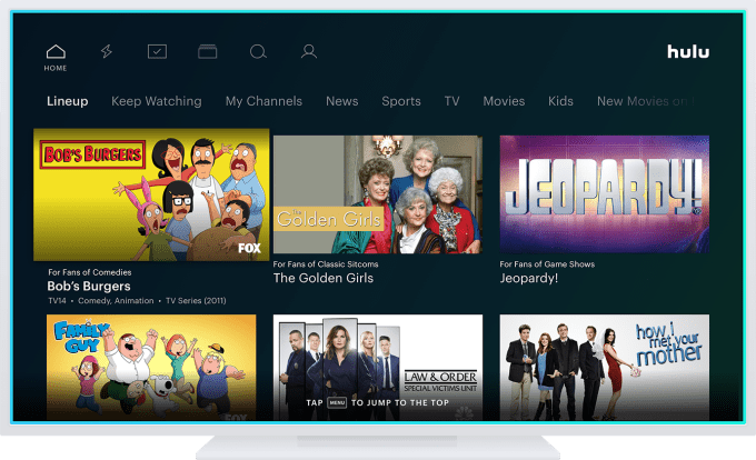
For example, Hulu will soon have more content appear on the screen as you scroll down in the user interface, so you can scan the thumbnails and make a decision more quickly.
It’s also adding a larger, more prominent “Details” button on content within its various collections – like the Lineup (or whatever replaces it), as well as sections like “Kids,” “News” or “Sports,” for example. This button will take you to the details page for that show or movie you’re interested in.
It’s adding more metadata next to the content, too, including things like the genre, rating, and the year which will help users make a choice more quickly.
On the content’s Details page, there will be a stacked list of quick actions for things like playing the next episodes, adding items to “My Stuff,” or managing your relationship with the show.
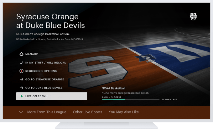
This latter option is a small but useful tweak that takes you to an area where you can adjust your suggestions and watch history – meaning you can mark something as watched or unwatched. This will be particularly beneficial for those times when you’ve begun watching a program on another streaming service, and now want to pick it up again on Hulu. Today, Hulu wouldn’t have any way of knowing if you’ve viewed those episodes outside its app – but now you’ll be able to explicitly say so.
You’ll also be able to mark content as unwatched, which could help if you’ve fallen asleep while watching TV, for example, or someone else watched the show while logged into your profile.
New visual templates will make finding news, sports and kids content easier with things like matchup artwork for games and movies identified by their poster, for instance.
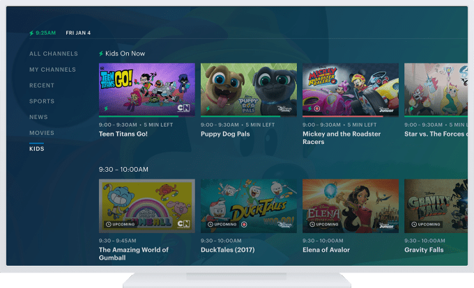
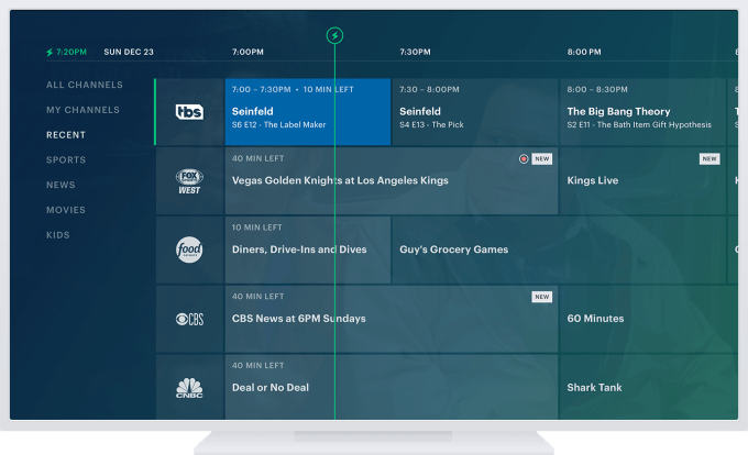
On the Live TV side, subscribers will be able to view a full two weeks out on the programming guide, instead of just what’s airing now and next. The navigation here – like Recent Channels, My Channels, All Channels, etc. – has also moved from the top to the left side for easier access.
While these various changes will be rolling out this spring, Hulu plans to continue to iterate on the user interface through the year.
Read more
January 09, 2019 at 04:24PM
from TechCrunch
via IFTTT


No comments